Evaluation
1. In what ways does your media product use, develop or challenge forms of convetions of real media products?
For my front page I used all the conventions of a typical music magazine. I followed a house style of yellow black and white because these are some of the colours which reflect the models outfit. The teasing content (or quote) from the article is multi-coloured, each colour letter in different colour from the models t-shirt, I did this to link the model and the quote and so the audience understand the exclusive article is about the model on the splash. I used a barcode, date, price and issue number because this is always used on a music magazine and all together makes the magazine look a lot more professional. The masthead was placed in a white box with a yellow outline to make it stand out from the rest of the colours on the splash. The word ‘JAM’ stands for ‘Just Amazing Music’ and to shorten the masthead and title of my magazine is typical of music magazines because in my research I found that many music magazines were shortening their title which had a meaning behind it, for example ‘NME’ stands for ‘New Musical Express’. I placed the skyline at the bottom of the splash because it looked more well-presented rather then it been at the top because it looked to crowded and it was hard to fit everything at the top.
The one convention I didn’t use was a sell line, this was because I couldn’t make it fit too look right. The page would have been too crowded and I wanted the cover lines to be more clear to read rather then it been to compact.
For my contents page I used some of the conventions. For example I used several images because during in research I found that most used images placed in boxes to emphasis different articles within the magazine. I also used different headings for different sections. This makes different sections of the magazine stand out more and easier for the reader to see which page which articles are on. I used a review section because most magazines used review sections. Also on my contents page magazine I used a subscriptions box. This was placed in a brightly coloured box which still kept with the house style of the magazine. The word ‘save’ was coloured in red to make it stand out against the rest of the text within the subscription box. During my research I noticed NME often did this and always placed it within the house style and at the bottom of the page. My contents page also used numbers without the word page in front of it, I think this made my work look more professional and was a lot clearer for the reader. The main article has its own image with a page number in the bottom corner, in my research I noticed NME did this a lot for the main article. In the section boxes I used the word ‘page’ because I saw this as a separate part of the magazine and wasn’t a part of the exclusive article within the magazines. I used a features section as well as review section because this put them into heading and section for the audience and therefore made it clearer.
The conventions I didn’t use were the editor’s letter. I didn’t use the editors letter because I did try it but the page looked to full of boxes and there wasn’t much variety. I also didn’t use it because I noticed during my research that editor’s letters weren’t something of big importance, the contents page felt more of use for what was actually in the magazine then what the editor’s letter.
For my double page spread I used all of the conventions. I used a large headline to indicate it was the exclusive interview talked about on the front page. I used a large main image with the model looking directly at the reader as well as leaning into the camera to engage the reader and catch the reader’s eye so they’re more likely to stop and read the article rather then turn the page. I used an introductory paragraph for readers who don’t know about Eve, and to explain what the interview and article for readers who just want to know without reading. It also made the article more professional and during my research introductory paragraphs were used a lot and seemed more professional. I used a drop cap to emphasise that the article was about this artists, that it was their interview and their exclusive. And from past experiences of reading music magazines it was something which magazines do a lot to make the article exclusive to the artist as well as making it clear to the reader that the article was about just that artist. I used a pull quote to attract the reader and to get them interested as well as making sure the audience picked out the main parts within the interview. Pull quotes are often used to keep the reader interested as well as making the audience interested in reading the article. The pull quote was placed in a box to make it a separate part to the article as well as making it stand out. I also used a byline and a photo credit as this is typical of any magazine and I used them to make my product look more professional as well as giving credit to the writer and photographer.
2. How does your media product represent particular social groups?
My magazine is aimed around people who enjoy listening to pop music. I did this because a lot of magazines are now more aimed at the indie stereotypes and pop music has been shunned into the background. I also thought that a pop magazine would appeal more to my target audience age. Because of my house style I feel my magazine reflects more a pop theme with bright colours and the font also reflects my chosen genre. Because of the way the model is dressed I also think my chosen genre fits with the way the model is dressed and looks. Her top has the slogan ‘HAVE THE TIME OF YOUR LIFE’ written in different colours with a pop style font. On the contents page she’s holding a pink guitar which is a bright colour and can also be associated with pop magazines. On the double page spread she’s wearing more dull colours but the purple t-shirt reflects the genre also.
My target audience would still fit into the E category because it isn’t an intelligence magazine but the topics are casual and informal. The magazine is more aimed at fun topics rather than serious intellectual magazines. The magazine has a relaxed feel and is very down to earth. The magazine is affordable at only £2.00 an issue and distributed every month meaning the articles will be full of contents and will be worth the money. The magazine is better aimed to those who are looking for a fun, gossipy magazine rather than something made for intellectual topics which have much thinking behind them. Based on the Marxists theory my magazine is aimed at the proletarians with bread and circuses feel to the magazine, with gossip and fun articles.
3. What kind of media institutions might distribute your media products and why?
Through my research I learnt about many institutions and the magazines in which they already distribute. Through this research I learnt about Bauer Media, Conde Nast and IPC media.
Because if my research I learnt that Bauer media publish NME magazine, publishers of Heat radio and also play a part in FHM the men’s magazine. All these media institutions are very successful and are always high quality. Bauer media are very successful with approximately 400 magazines, 110 websites and 50 radio and TV programmes. They employ over 8,700 employers, the distribute media products in 15 different countries including the US and China.
For my research into existing media texts I researched a media institution called Conde Nast. This is a company based in America. They are in charge of publishing magazines such as; Vogue, Vanity Fair, The New Yorker and GQ. They sell more than 126 magazines, and publish 104 web pages as well as selling to over 24 global countries.
Lastly I researched a media institution called IPC media. This media institution is also highly successful, they publish magazines such as; Nuts Magazine (men’s magazine), Look and Now both highly successful women’s magazine and NME. IPC media produces over 60 iconic media brands, the institution prints to cater for over 42% of men and 48% of UK woman. The brand website reaches over 20 million users each month.
For my magazine I have think that Bauer media would be a good institution to distribute my music. I think this because they specialise in more the musical side of publishing, were as IPC media and Conde Nast focus more on weekly woman’s magazine’s and fashion magazines rather than music magazines.
4. Who will be the audience for your media product?
My media product is aimed at both boys and girls. I did this widen my audience and appeal to more people. Initially I aimed my magazine at boys and girls aged between 16-24 but as my product developed I saw a gap in the market for people of younger ages and decided to create a product which was more aimed at 14- 20 this was so that my audience again widened as well as creating a product which isn’t really widely available. My decision was also based on the fact that the younger generation are growing up fast and are often restricted from magazines which are more aimed at older generations but with this magazine it’s aimed at both. My magazine will stick to a relaxed feel and won’t contain a lot of explicit text or images which magazines seem to be doing a lot due to the increase in ‘Indie’ bands and a lot more people are turning ‘Indie’ to follow the genre of music which they listen to. Indie bands often break the rules and dare to be bold. With my magazine I wanted a more subtle feel to the magazine rather a lot of explicit texts. I wanted my magazine to be different but in a good way which would appeal to more people.
My magazine audience would fit into the ‘vals’ category of the psychographic, this is because my magazine still fits with people who have their own values and opinions rather than following trends. My magazine is also aimed at people who take in social values rather than going against the rules, I wanted my magazine to be clean cut with too much explanatory contents I wanted my magazine to be a moral values rather then been rebellious and too out there. I think that ‘Eve’ (the model for my magazine) reflects this well as she isn’t showing too much skin and isn’t posing with cigarettes which in my research I saw a lot to emphasis the rebellious side of these magazines. I wanted my magazine to be different and the ‘norm’ now in media texts is to be rebellious, it’s not something which we don’t see every day because we do and I wanted my magazine to be different and stand out to my target audience.
5. How do you attract/ address your audience?
For my magazine I made sure that the contents would appeal to my target audience. I made the colours bright and bold so that it stands out on a news stand. I also made the colours on the splash relate back to the main article so that my audience knew that ‘Eve’ was the main focus of this week’s issue. My magazine also reflects the values of my psychographic target audience as it didn’t push the boundaries of rebellion like most magazines do. My magazine was also aimed at a target audience who fit into ‘Maslow's Hierarchy Of Needs’ they all have food and shelter provided, have the feeling of belonging to a group and all have an interest in music.
I made the magazine affordable as the magazine was aimed at the younger generation and I wanted them to feel as though the price was reasonable. I priced my magazine at £2.00 and the magazine will be issued every fortnight so that the magazine contains a lot more contents than weekly magazines.
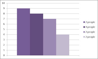
This graph shows the number of people who gave a rating out of ten on my magazine, the majority of the people stated that my magazine was an 8/10.
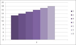
This graph shows the age range at which my magazine was suspected to be targeted at and the number of people who put it into that age range.
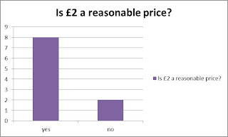
This graph shows how many people are willing to pay £2 for a fortnightly issue. It also shows how many people said that £2 was unreasonable and wouldn’t pay for it.
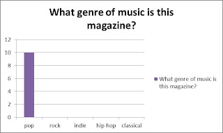
This graph shows what genre of music people thought my magazine was, all the people recognised my magazine as pop which is the genre my media product is.
6. What have you learnt about technologies from the process of constructing this product?
From using Photoshop I have learnt that using a background copy is recommended because if the image goes wrong you have the original copy to use again and this means the original image won’t be ruined and is usable again.
I learnt how to use the spot healing tool which helped when using the airbrushing the image. I spot healing tool came in hand to make the cover look professional.
I learnt how to use the quick selection tool which again helped give the model an airbrushed look. The quick selection tool as came in handy when I needed to make small colour changes which I did to create nail polish which wasn’t there before but gave the model colourful nails to match the cover and fit with the house style.
I learnt how to duplicate a layer instead of making three separate layers which are all the same; it was easy to make two more layers which looked like the one you’d already done work on. I used this tool when giving the model airbrushed skin.
All these tools helped me be able to create an airbrushed look which gave the magazine a more professional feel to it. I liked how the model could look good while looking directly at the camera/ audience.
From using Photoshop I have also learnt how to change the size of an image which can also bring the image forward; I have learnt how to rotate images etc. and this has helped to create a better quality media product.
7. Looking back at your preliminary task, what do you feel you have learnt in the progression from it to the full product?
Preliminary Task
Music Magazine
Through doing this project I now know how a music magazine should be constructed through the codes and conventions. I always learnt what the conventions of a magazine are and this helped me to make the progress that I have. Because of photo shop I have learnt how to alter an image to suite the theme I’m looking for. I have learnt that a target audience is important so that you can know how your product should look to suite that audience. My magazine has also taught me what it means to plan and develop an idea. I learnt that it’s better to do less than do too much. My masthead, cover lines, sell lines, quotes all had to be the right size and colour and before I always thought it was ok for them to be any size and colour without much consideration for house styles etc.
Before starting this task I didn’t know how to use Photoshop properly and could only manage the basics. I also didn’t know the conventions of magazine and had to really work to stick to those without going of task I doing what I thought was right but now know isn’t. I didn’t know how a magazine should look but now know that it’s important to attracting an audience. My two pieces of work are so different because I now understand the process at which you have to plan and develop an idea. I also can see how each product alters due to the fact I have learnt the codes and conventions of a magazine. The two products are so different because I have a better knowledge and understanding of a piece of media text and know how to form it to please my target audience. My first media product was about putting more cover lines in rather than quality of the image etc. but now I understand that less is more. Also I recognise that the image has to be reflective of the genre. In my first product the model was positioned to far away from the audience/ reader whereas now the model is leaning into the audience/ reader to make it look as though she is connecting to the audience. The image has to be strong so because this is what the audience/ reader sees before the contents of the magazine. It sets a bar for the quality of the magazine.
Word count- 2,933


